
Wainscot Media is proud to announce the launch of My Mo‑Town, a new lifestyle magazine and digital media platform serving the Morristown, NJ area, including Morris Township. The first issue and full digital content will be available in February 2026.
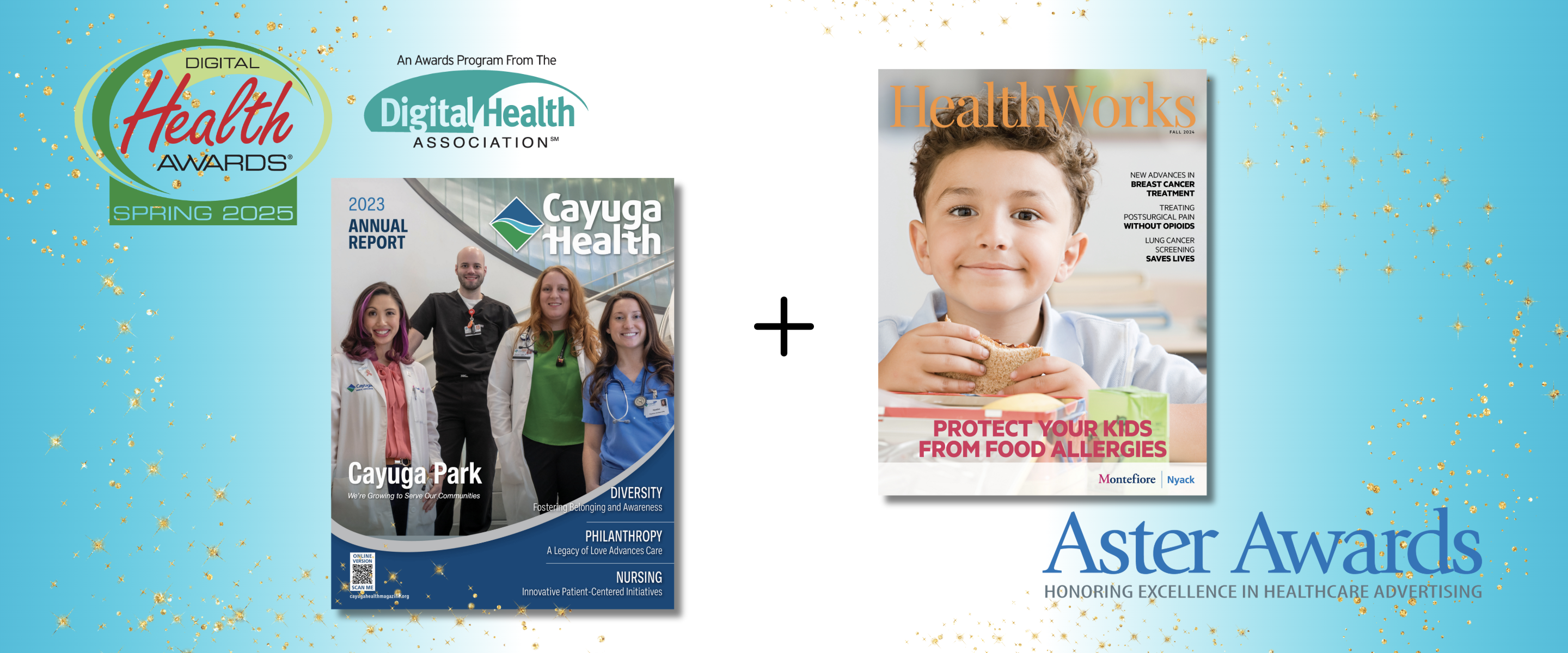
Wainscot Health, a leading provider of content-driven marketing solutions for healthcare organizations, has been honored with two prestigious national awards recognizing excellence in healthcare communications.
.png)
Wainscot Health has been honored with a Silver Award in the Facebook Marketing category at the 5th Annual Healthcare Digital Marketing Awards (HDMAwards) for its work with Shelbourne Knee Center.

The multichannel, one-two punch of print and digital performs better than either platform alone.

Not taking advantage of video’s strengths? Following these steps can help you create custom productions that trigger action.

Not every headline can offer a perfect blend of grabby words that snag readers and keywords that aid a search. But following these steps can help draw readers’ interest, shape their thinking and, most importantly, steer their actions.

Step-by-step instructions on honing your story's angle.

Earnshaw’s and Footwear Plus are being recognized alongside publications such as The New York Times, Bon Appétit, Vanity Fair and Fortune

The event will be hosted Sunday, January 22, and Monday, January 23, 2023, at the Metropolitan Pavilion in New York City.

Marketing campaigns receive national recognition through competitive Healthcare Digital Marketing Awards

Wainscot took top honors taking home Gold (top 5% in the nation) in the service line category “Women’s” and Silver (top 12% in the nation) in “Newsletter/External-Single.”

Recognized as the “Pulitzer Prize of the business press,” the Jesse H. Neal Award finalists and winners are selected for exhibiting journalistic enterprise, service to the industry and editorial craftsmanship

Award-winning team partners to offer shoe brands and retailers marketing services through Footwear Plus Studio
.png)
Learn how an integrated marketing campaign using print and digital together can amplify results and help reach goals faster.

Earnshaw’s magazine and Wainscot Media today announced the opening of Earnshaw’s Studio, a one-stop marketing shop for businesses within the kids’ fashion space. Earnshaw’s, a family-owned print publication created in 1917, is considered the largest network of childrenswear-specific resources in the U.S.and is currently the only business-to-business publication in the industry. The children’s fashion connoisseurs at Earnshaw’s will manage creative ideation for Earnshaw’s Studio, supported by a team of award-winning content creators at the brand’s parent company, Wainscot Media.

Wainscot Media introduces Society for International Menswear, a highly edited showcase exclusively of select international contemporary & sartorial brands, including sportswear, tailored clothing, footwear and accessories. The new event is slated to debut Sunday, July 17 and Monday, July 18 in New York City at the Metropolitan Pavilion.

Four Wainscot Media magazines were honored in the 19th Annual Service Industry Advertising Awards (SIAAwards) for their excellence in advertising and content in 2021. Wainscot won gold, silver and bronze in the retail publication category for Garmany, ACCENT (on behalf of Hamilton Jewelers) and Lee Michaels, respectively. In the healthcare publication category, Wainscot won silver for Monmouth Health & Life.

Wainscot Health wins Silver in the Digital Health Awards for a microsite developed for The Breast Center at Montefiore Nyack Hospital.

Diagnostic and Interventional Cardiology (DAIC) magazine has won a prestigious Jesse H. Neal Award for its COVID-19 coverage during 2020. DAIC won the award for Best Technical/Scientific Content for its entry "delivering Detailed Medical Information to Clinicians During COVID-19."

Park Ridge, N.J.-based publisher Wainscot Media has acquired Imaging Technology News (ITN) and Diagnostic and Interventional Cardiology (DAIC) from Scranton Gillette Communications of Arlington Heights, Ill.

Although cost and other pressures from the pandemic have caused some marketers to curtail their activities, for those in healthcare, reaching out to consumers is more important now than ever.
As we reach the one-year anniversary of the COVID-19 pandemic, we’re reminded of the value of provider stories. During the first surge, these stories were shared frequently by hospitals and the media. As the pandemic has worn on, we’ve heard far fewer accounts of what it’s like to work on the front lines. But those stories are still out there, waiting to be told.

Storytelling can engage readers and attract new patients, but words simply aren’t enough. High-quality photography grabs viewers’ attention and can inspire them to take action. Here are three ways to harness the power of a portrait.

We’ve all learned to scan for key facts and are careful not to waste time before moving on to another source that can provide the same information in less time. That’s why content is king—quality content, that is.

You can reuse, recycle and repurpose content to streamline your workload and get results. The key is to be intentional as you’re creating your marketing calendar.
Wainscot Media is proud to announce the launch of My Mo‑Town, a new lifestyle magazine and digital media platform serving the Morristown, NJ area, including Morris Township. The first issue and full digital content will be available in February 2026.
Wainscot Health, a leading provider of content-driven marketing solutions for healthcare organizations, has been honored with two prestigious national awards recognizing excellence in healthcare communications.
Wainscot Health has been honored with a Silver Award in the Facebook Marketing category at the 5th Annual Healthcare Digital Marketing Awards (HDMAwards) for its work with Shelbourne Knee Center.
The multichannel, one-two punch of print and digital performs better than either platform alone.
Not taking advantage of video’s strengths? Following these steps can help you create custom productions that trigger action.
Not every headline can offer a perfect blend of grabby words that snag readers and keywords that aid a search. But following these steps can help draw readers’ interest, shape their thinking and, most importantly, steer their actions.
Step-by-step instructions on honing your story's angle.
Earnshaw’s and Footwear Plus are being recognized alongside publications such as The New York Times, Bon Appétit, Vanity Fair and Fortune
The event will be hosted Sunday, January 22, and Monday, January 23, 2023, at the Metropolitan Pavilion in New York City.
Marketing campaigns receive national recognition through competitive Healthcare Digital Marketing Awards
Wainscot took top honors taking home Gold (top 5% in the nation) in the service line category “Women’s” and Silver (top 12% in the nation) in “Newsletter/External-Single.”
Recognized as the “Pulitzer Prize of the business press,” the Jesse H. Neal Award finalists and winners are selected for exhibiting journalistic enterprise, service to the industry and editorial craftsmanship
Award-winning team partners to offer shoe brands and retailers marketing services through Footwear Plus Studio
Learn how an integrated marketing campaign using print and digital together can amplify results and help reach goals faster.
Earnshaw’s magazine and Wainscot Media today announced the opening of Earnshaw’s Studio, a one-stop marketing shop for businesses within the kids’ fashion space. Earnshaw’s, a family-owned print publication created in 1917, is considered the largest network of childrenswear-specific resources in the U.S.and is currently the only business-to-business publication in the industry. The children’s fashion connoisseurs at Earnshaw’s will manage creative ideation for Earnshaw’s Studio, supported by a team of award-winning content creators at the brand’s parent company, Wainscot Media.
Wainscot Media introduces Society for International Menswear, a highly edited showcase exclusively of select international contemporary & sartorial brands, including sportswear, tailored clothing, footwear and accessories. The new event is slated to debut Sunday, July 17 and Monday, July 18 in New York City at the Metropolitan Pavilion.
Four Wainscot Media magazines were honored in the 19th Annual Service Industry Advertising Awards (SIAAwards) for their excellence in advertising and content in 2021. Wainscot won gold, silver and bronze in the retail publication category for Garmany, ACCENT (on behalf of Hamilton Jewelers) and Lee Michaels, respectively. In the healthcare publication category, Wainscot won silver for Monmouth Health & Life.
Wainscot Health wins Silver in the Digital Health Awards for a microsite developed for The Breast Center at Montefiore Nyack Hospital.
Diagnostic and Interventional Cardiology (DAIC) magazine has won a prestigious Jesse H. Neal Award for its COVID-19 coverage during 2020. DAIC won the award for Best Technical/Scientific Content for its entry "delivering Detailed Medical Information to Clinicians During COVID-19."
Park Ridge, N.J.-based publisher Wainscot Media has acquired Imaging Technology News (ITN) and Diagnostic and Interventional Cardiology (DAIC) from Scranton Gillette Communications of Arlington Heights, Ill.
Although cost and other pressures from the pandemic have caused some marketers to curtail their activities, for those in healthcare, reaching out to consumers is more important now than ever.
As we reach the one-year anniversary of the COVID-19 pandemic, we’re reminded of the value of provider stories. During the first surge, these stories were shared frequently by hospitals and the media. As the pandemic has worn on, we’ve heard far fewer accounts of what it’s like to work on the front lines. But those stories are still out there, waiting to be told.
Storytelling can engage readers and attract new patients, but words simply aren’t enough. High-quality photography grabs viewers’ attention and can inspire them to take action. Here are three ways to harness the power of a portrait.
We’ve all learned to scan for key facts and are careful not to waste time before moving on to another source that can provide the same information in less time. That’s why content is king—quality content, that is.
You can reuse, recycle and repurpose content to streamline your workload and get results. The key is to be intentional as you’re creating your marketing calendar.


